next up previous
Next: Shading Up: Static Illustration Principles Previous: Static Illustration Principles

Lines in Technical Illustration

  Several researchers [5,6,14,23] examined which lines should be drawn in a computer generated image to maximize the amount of information conveyed while minimizing the number of lines drawn. They observed that illustrators use edge lines, consisting of surface boundaries, silhouettes, discontinuities, and creases to separate individual parts and to suggest important features in the shape of each object. These static images represented edge lines with black lines of uniform weight.


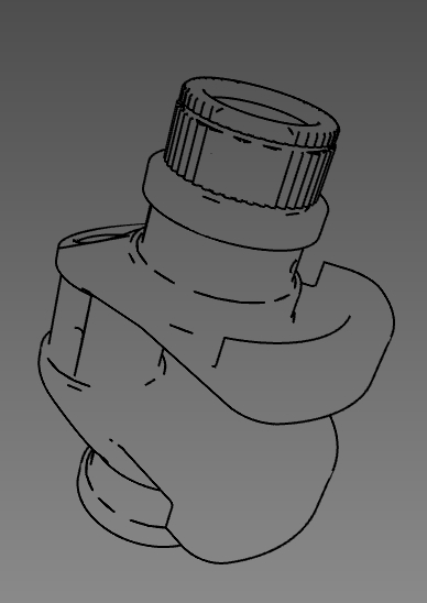
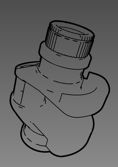
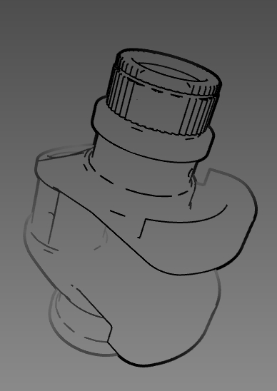
Figure 2: Three line conventions suggested by Martin [14]. Left: single weight used throughout the image. Middle: heavy line weight used for outer edges, other lines are thinner. Right: vary line weight to emphasize perspective.


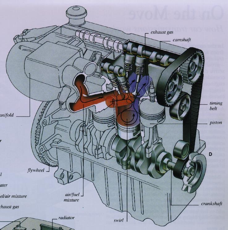
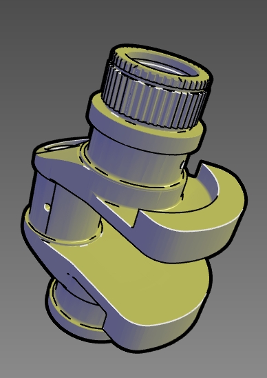
Figure 3: Left: Illustrators sometimes use the convention of white interior edge lines to produce a highlight. Image copyright 1995 Macmillan [20]. Used by permission. Right: An image produced by our system, including shading, silhouettes and white crease lines.

There are many line weight conventions which the illustrator chooses among based on the intent of the image. Martin [15] discusses three common conventions, shown in Figure 2: a single line weight used throughout the image, two line weights with the heavier describing the outer edges, and varying the line weight along a single line emphasizing the perspective of the drawing with heavy lines in the foreground. One way of achieving the latter effect in raster graphics is to vary the line weight dependent upon the direction of the light source or in an user specified direction, giving a shadowed effect to the line. Most illustrators use bold external lines, with thinner interior lines, which aid in the perception of spaces [4].

In almost all illustrations, edge lines are drawn in black. Occasionally, if the illustration incorporates shading another convention is used in which some of the interior lines are drawn in white like a highlight. Lines drawn in black and white suggest a light source and denote the models orientation. For example, Figure 3 compares an illustration produ ced by an artist and an image from our system in which white creases are drawn.


next up previous
Next: Shading Up: Static Illustration Principles Previous: Static Illustration Principles