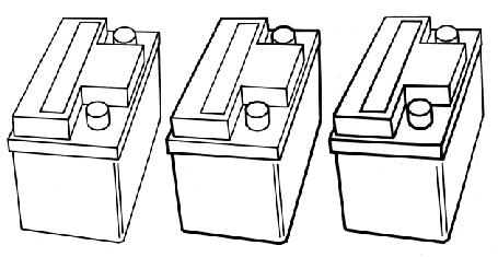
There are many line weight conventions and an illustrator chooses a specific line weight convention dependent upon the intent of the 2D image. In the book Technical Illustration, Martin [20] discusses three common conventions, as shown in Figure 7:
|


 |
| |
One way of achieving the latter effect in raster graphics is to vary the line weight dependent upon the direction of the light source or in an user specified direction, giving a shadowed effect to the line. Most illustrators use bold external lines, with thinner interior lines, which aid in the perception of spaces [8].
Other less often used conventions include varying the line due to abrupt changes in the geometry (curvature based). A method for automatically generating these kind of edges is discussed in Section 10 of the notes, as well as by Raskar and Cohen [22]. However, for the purpose of technical illustration, most illustrators use bold external lines, with thinner interior lines.