 |
We can generalize the classic computer graphics shading model to
experiment with tones by using the cosine term (![]() ) of Equation 1 to blend between two RGB colors,
kcool and kwarm:
) of Equation 1 to blend between two RGB colors,
kcool and kwarm:
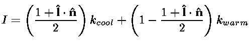 |
(2) |
An image that uses a color scale with little luminance variation is shown in Figure 6. This image shows that a sense of depth can be communicated at least partially by a hue shift. However, the lack of a strong cool to warm hue shift and the lack of a luminance shift makes the shape information subtle. We speculate that the unnatural colors are also problematic.
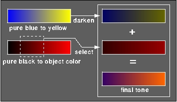
In order to automate this hue shift technique and to add some luminance variation to our use of tones, we can examine two extreme possibilities for color scale generation: blue to yellow tones and scaled object-color shades. Our final model is a linear combination of these techniques. Blue and yellow tones are chosen to insure a cool to warm color transition regardless of the diffuse color of the object.
The blue-to-yellow tones range from a fully saturated blue:
k blue = (0, 0, b), b in the range [0,1],
in RGB space to a fully saturated yellow:k yellow = (y, y, 0), y in the range [0,1]. This produces a very sculpted but unnatural
image, and is independent of the object's diffuse reflectance kd.
The extreme tone related to kd is a variation of diffuse shading
where kcool is pure black and kwarm = kd. This would look much like
traditional diffuse shading, but the entire object would vary in
luminance, including where ![]() is less than 0. What we
would really like is a compromise between these strategies. These
transitions will result in a combination of tone scaled object-color
and a cool-to-warm undertone, an effect which artists achieve by
combining pigments. We can simulate undertones by a linear blend
between the blue/yellow and black/object-color tones:
is less than 0. What we
would really like is a compromise between these strategies. These
transitions will result in a combination of tone scaled object-color
and a cool-to-warm undertone, an effect which artists achieve by
combining pigments. We can simulate undertones by a linear blend
between the blue/yellow and black/object-color tones:
 . The values for b
and y will determine the strength of the overall temperature shift,
and the values of will determine the prominence
of the object color and the strength of the luminance shift. Because
we want to stay away from shading which will visually interfere with
black and white, we should supply intermediate values for these
constants. An example of a resulting tone for a pure red object is
shown in Figure 2.
. The values for b
and y will determine the strength of the overall temperature shift,
and the values of will determine the prominence
of the object color and the strength of the luminance shift. Because
we want to stay away from shading which will visually interfere with
black and white, we should supply intermediate values for these
constants. An example of a resulting tone for a pure red object is
shown in Figure 2.
Substituting the values for kcool and kwarm from Equation 3
into the tone Equation 2 results in shading with values
within the middle luminance range as desired. Figure 7
is shown with b = 0.4, y = 0.4,
![]() = 0.2, and = 0.6. To show that the exact values are not crucial to appropriate
appearance, the same model is shown in Figure 8 with
b= 0.55, y = 0.3,
= 0.2, and = 0.6. To show that the exact values are not crucial to appropriate
appearance, the same model is shown in Figure 8 with
b= 0.55, y = 0.3, ![]() = 0.25, and = 0.5. Unlike
Figure 5, subtleties of shape in the claws are visible
in Figures 7 and 8.
= 0.25, and = 0.5. Unlike
Figure 5, subtleties of shape in the claws are visible
in Figures 7 and 8.
The model is appropriate for a range of object colors. Both traditional shading and the new tone-based shading are applied to a set of spheres in Figure 9. Note that with the new shading method objects retain their ``color name'' so colors can still be used to differentiate objects like countries on a political map, but the intensities used do not interfere with the clear perception of black edge lines and white highlights.