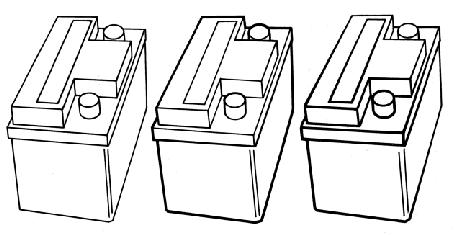
There are many line weight conventions and an illustrator chooses a specific line weight convention dependent upon the intent of the 2D image. In the book Technical Illustration, Martin [25] discusses three common conventions, as shown in Figure 3.6:
|
| Figure 3.6: Three line conventions suggested by Judy Martin [25]. Left: single line weight used throughout the image. Middle: heavy line weight used for out edges and parts with open space between them. Right: vary line weight to emphasize perspective. Copyright 1989 Macdonald & Co. (Publishers) Ltd. [25]. |
Other less often used conventions include varying the line weight dependent upon the direction of the light source, giving a shadowed effect or varying the line due to abrupt changes in the geometry (curvature based). However, most illustrators use bold external lines, with thinner interior lines.