|
|

|
|
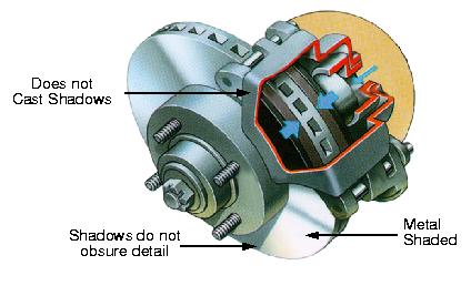
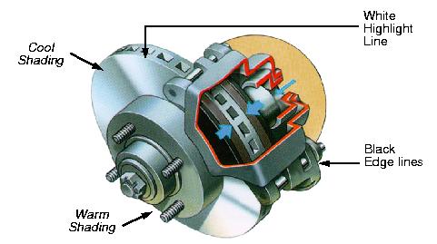
| Figure 3.1: Technical illustration conventions. Copyright 1995 Volvo Car UK Limited [28]. | |
The illustrations in several books, e.g., [25,28], imply that illustrators use fairly algorithmic principles. Although there are a wide variety of styles and techniques found in technical illustration, there are some common themes. This is particularly true when examining color illustrations done with air-brush and pen. The following characteristics are present in many illustrations, as shown in Figure 3.1:
These form only a subset of the conventions used by illustrators. I have concentrated only on the material property and shading aspects of illustration. Work done in computer graphics by Seligmann and Feiner [34] and Dooley and Cohen [11] concentrate on additional aspects of technical illustration like layout, object transparency, and line style.
These characteristics result from a hierarchy of priorities. The edge lines and highlights are black and white, respectively, and provide a great deal of shape information themselves. Several studies in the field of perception [2,4,8,35] have concluded that subjects can recognize 3D objects at least as well, if not better, when the edge lines (contours) are drawn versus shaded or textured images. Christou et al. [7] concluded in a perceptual study that ``a few simple lines defining the outline of an object suffice to determine its 3-D structure''(p. 712). As seen in children's coloring books, humans are good at inferring shape from line drawings. Lines can help distinguish different parts and features of an object and draw attention to details which may be lost in shading. As demonstrated by Figure 3.1(a), many illustrators use black edge lines to separate parts. Sometimes an illustrator might choose to use a white highlight line instead of a black edge line for interior silhouettes or discontinuities. Deciding which lines to draw and how to draw them is essential in imitating the conventions used in technical illustration. In Section 3.1, I will discuss the rules, properties, and types of lines needed to convey shape information like the line drawings of technical illustrators. In the next chapter I will discuss implementation details.
When shading is added, in addition to edge lines, shape information can be maximized if the shading uses colors and intensities that are visually distinct from both the black edge lines and the white highlights. This means the dynamic range available for shading may be limited. Figure 3.1(a) provides a good example of how an illustrator uses lights and artistic shading. In the figure, the light is up and to the right of the object and produces highlights as you would expect in a computer-generated Phong-shaded image. However, the illustrator also used cool shading for the upper part of the object with warm shading on the lower, bottom half of the object. This cool and warm shading is not dependent upon the light and may have been used to pull the eye from the cut-a-way to the bottom of the image. Illustrators rarely use shadows in an illustration. As shown in Figure 3.1(b), shadows are used only when they do not obscure details in other parts. Another important characteristic used in technical illustration is the conveyance of material property. Figure 3.1(b) shows how an illustrator alternates bands of light and dark to represent a metallic object, similar to the real anisotropic reflections seen on real milled metal parts. These shading conventions will be investigated in detail in Section 3.2.